

A reader lands on your blog, devours your content, nods along, and then… disappears.
No email signup. No download. No next step. Frustrating, right?
That’s where strategically placed call-to-action banners work their magic.
These eye-catching content promotions guides people toward actions such as joining your list, snagging a freebie, or even making a purchase. But the key isn’t just slapping them anywhere.
Strategically embedding relevant, value-driven CTAs at just the right moments in your blog, helps transform passive visitors into engaged leads.
Let’s look at how to turn your blog into a lead-generating powerhouse with strategic CTA banners!
Your blog is more than just a space for storytelling or news – it’s a powerful tool for growing your audience and attracting dream clients.
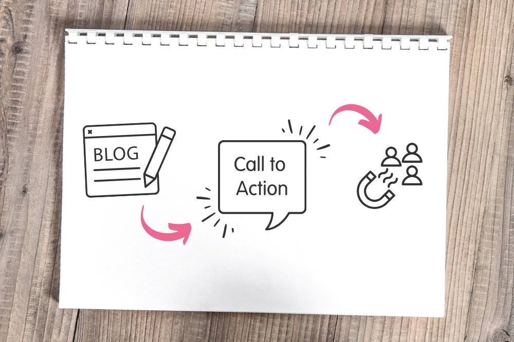
The best way to get leads from your posts is with strategic call-to-action (CTA) placement.
So don’t just have a single call to action at the bottom of your posts, sprinkle them throughout your posts. I recommend a mix of the usual in-text CTA links, buttons and eye-catching banner graphics.
You can also try content upgrades – bonus resources like exclusive worksheets or create downloadable checklists tailored to each blog topic. These little perks make signing up a no-brainer!
With the right approach, your blog will generate leads like a dream!
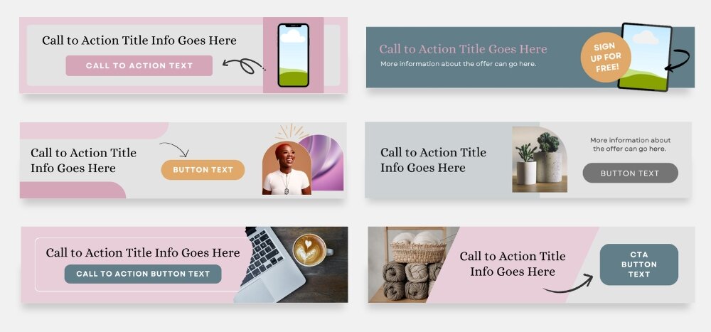
Here are a few effective options of CTA’s you can use in blog posts:
Next, let’s look at CTA banner graphics in more detail.
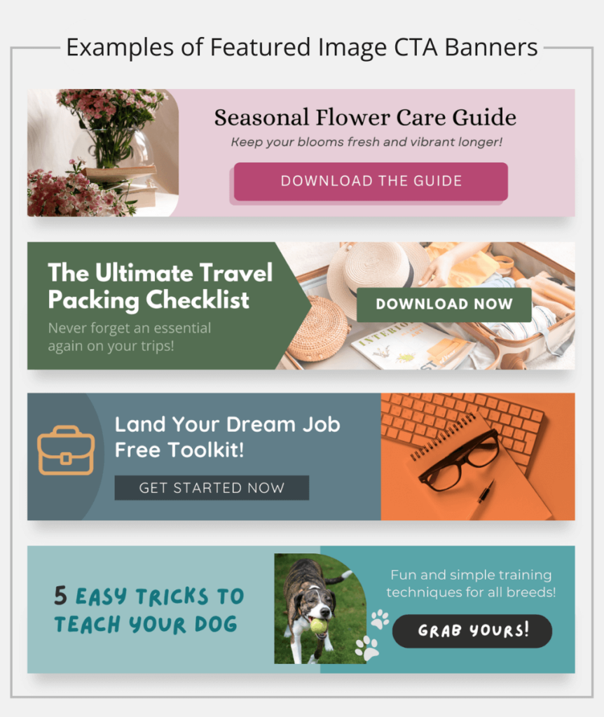
Featured Image CTA Banners
These work really well when the image features something that shows the solution to a problem in a lifestyle format and not a product listing photo or ordinary stock photo.
So for example a picture of some gorgeous flowers in bloom at home and not the florists own floral display.
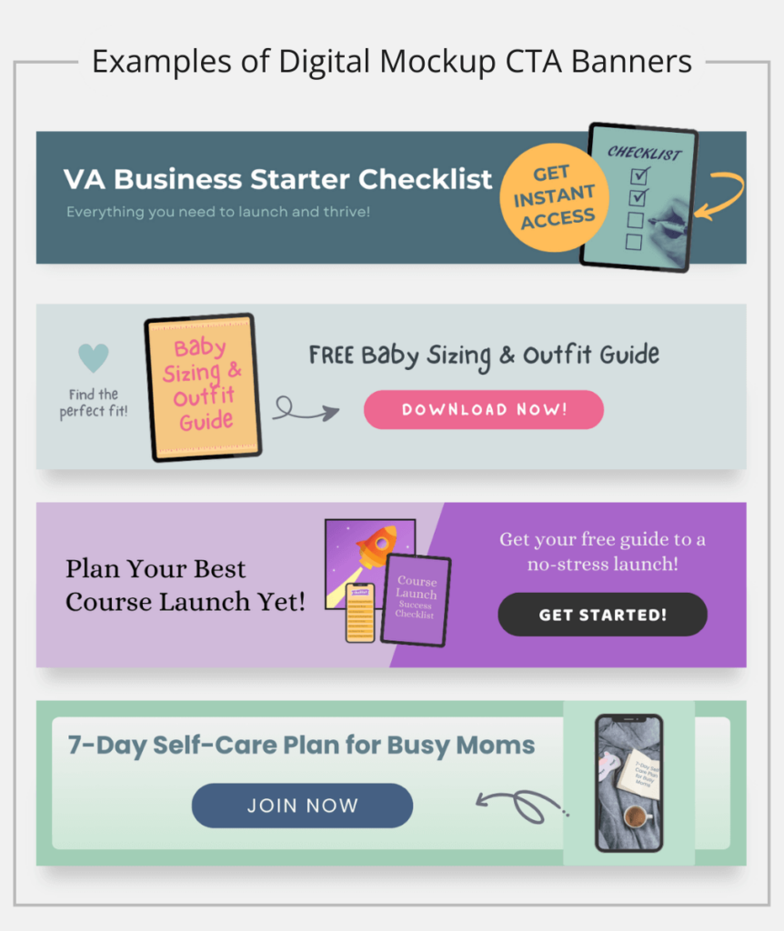
Digital Mockup CTA Banners
Mockup-style banners are great for showcasing digital offers your freebie as a workbook, checklist, or guide using digital product mockups.
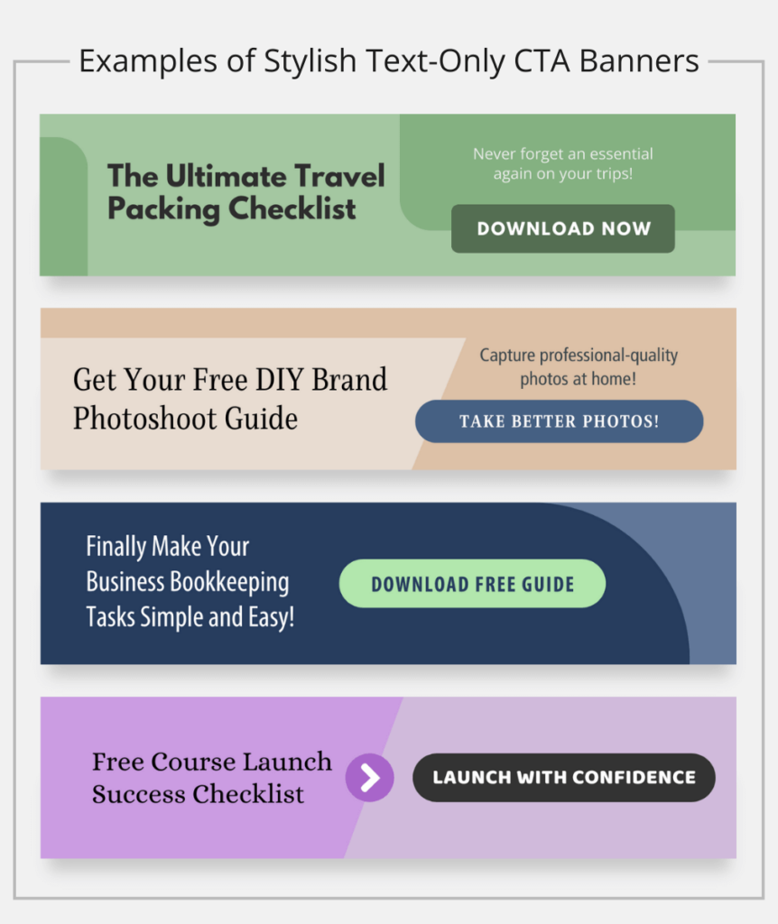
Bold Text-Only CTA Banners
Usually a sleek text-only banner graphic with a direct call-to-action, this style of banner is great for getting attention when you don’t have a suitable photo or graphic to feature in it.
You can use CTA banners to promote almost anything. For example, on my blog I use them to promote my free Canva template packs and sometimes, I feature a specific template kit available in my shop.
You could use them to promote digital products and resources like webinars and courses. You can also use them to showcase your physical products as well as discount codes and special offers.
Think about what would be most irresistible to your audience and align it with the blog post’s topic. If you’re looking for some more ideas on what kind of resources to give away check out my post with several lead magnet ideas for business owners.
Your banner needs to stand out visually to drive conversions. Canva makes it easy to design stunning banners, even if you’re not a designer. Here’s how:
Step 1: Choose the right dimensions
Creating a compelling call-to-action banner starts with getting the dimensions right. For blog content, I find that narrow banners around 1200 x 280px work really well. These dimensions provide just enough space for an eye-catching design without overwhelming the page.
For a head start, check out my Call-to-Action Banner Graphic Canva Template Kit to create polished, professional banners in minutes!
Step 2: Use high-contrast colors
Your banner should pop against the blog’s background. Use bold, high-contrast colors to make the CTA button prominent.
Color plays a massive role in grabbing attention. High-contrast color combinations help your CTA stand out against the background, making it impossible to ignore.
The trick is to make it feel like a natural extension rather than an intrusive ad. Choose colors that complement your brand while ensuring the CTA button is the focal point. A dull, washed-out banner won’t inspire action – vibrancy and contrast are key.
Step 3: Add a compelling headline & CTA
Your call-to-action text needs to be clear, concise, and compelling. A strong, benefit-driven headline paired with a direct CTA makes all the difference. Instead of a generic “Sign up now,” try something more enticing, like “Unlock Your Free Instagram Engagement Checklist” followed by a button that reads “Send It to Me!”. The goal is to make taking action feel irresistible!
Step 4: Consider including micro-copy
A short line of text above or below your CTA can provide extra reassurance or urgency. Adding something as simple as “Instant access – no wait!” or “100% money-back guarantee” can make clicking feel like a no-brainer.
Step 5: Feature appealing imagery
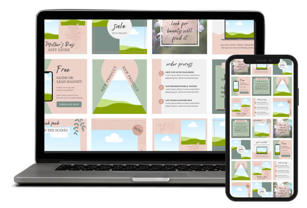
Include imagery that’s enticing and attractive to your audience. You can also consider using mockups to show what they’re getting!
Imagery ties everything together. Use high-quality visuals that align with your brand and appeal to your audience.
Mockups work particularly well, giving people a preview of exactly what they’re getting. When they can see the value, they’re much more likely to take action.
Step 6: Keep it fuss-free and focused
Keeping the design clean and focused ensures the message doesn’t get lost. Overcrowding your banner with text, graphics, or unnecessary elements creates visual noise that dilutes the impact.
White space is your friend – it helps your key message stand out and makes your banner feel polished and professional. As a clutter-free design makes it easier for your audience to absorb the information and take action without distractions.

Of course, these types of banner graphics aren’t limited to being used in blog posts, you can also use them in the following places:
Turning your blog into a lead-generating machine starts with strategically placing call-to-action banners that capture attention and encourage action.
Whether you use in-text links, buttons, or eye-catching graphics, the key is to align your CTAs with valuable lead magnets, content upgrades, or promotions.
Designing high-converting banners in Canva ensures they’re visually compelling, while sharing them beyond your blog – on social media, emails, and landing pages – extends their reach.
When done right, CTA banners transform casual browsers into engaged subscribers and even customers!
Save time and create stunning, conversion-focused CTA banners effortlessly. Turn your blog into a lead-generating machine with my Call-to-Action Banner Canva Template Kit!
Share to…

Sign up to get 10 free Canva templates for your social media.
Created with solopreneurs in mind, these templates offer a variety of content types to help boost your online presence!